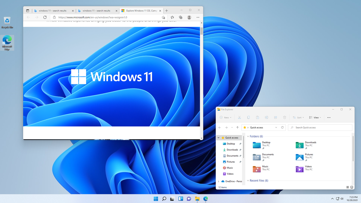
Windows 11 introduced a host of visual and functional updates to enhance the user experience. Among these changes, one of the most striking is the overhaul of system icons, with a focus on colorful, modern designs that bring a fresh aesthetic to the operating system. These color icons aren’t just about good looks; they’re part of a broader effort to improve usability and consistency across the Windows ecosystem. Let’s dive into what makes these icons stand out and how they elevate the Windows 11 experience.
The Design Philosophy
Windows 11’s color icons are rooted in Microsoft’s Fluent Design System, a framework aimed at creating visually cohesive and intuitive interfaces. These icons embody principles of simplicity, clarity, and flexibility. The vibrant colors are carefully selected to balance modernity and accessibility, ensuring they pop against light and dark backgrounds alike.
Unlike the monochromatic icons of previous Windows versions, the color icons in Windows 11 feature gradients and soft tones. These design choices give a sense of depth and dynamism, making the interface feel more alive. The consistent use of these icons across apps and settings helps users quickly identify and interact with features, reducing cognitive load.
Key Features of Windows 11 Color Icons
- Vivid and Recognizable Colors: Each icon’s color palette is crafted to enhance recognition. For instance, system folders like Documents, Downloads, and Pictures have distinct hues that align with their purpose.
- 3D-Like Effects: Subtle gradients and shadows create a pseudo-3D effect, adding depth and realism without overwhelming the design.
- Uniformity Across Platforms: These icons are designed to look great on high-resolution displays and scale effectively, ensuring consistency across different devices, from desktops to tablets.
- Accessibility-Friendly: Thoughtful use of contrast and color choices ensures the icons are visually accessible to users with color vision deficiencies. They are also optimized to work seamlessly with Windows’ high-contrast settings.
Impact on Productivity
The revamped icons contribute to a more organized and intuitive workspace. Users can quickly identify essential tools and folders at a glance, reducing the time spent searching for resources. This is especially important in professional and educational settings, where efficiency is paramount.
For example, in File Explorer, the color-coded folder icons make it easier to distinguish between types of files and directories. Similarly, updated taskbar and notification area icons provide clearer visual cues for system alerts and app statuses.
Customization and Personalization
Windows 11 also offers enhanced options for personalization. Users can adjust theme settings to complement the color icons, such as switching between light and dark modes or applying accent colors. These customizations allow individuals to tailor the operating system to their preferences while maintaining the cohesive look and feel of the Fluent Design System.
FAQs
Q: Can I revert to the old monochrome icons if I prefer them? A: Windows 11 does not natively provide an option to revert to old icons, but third-party tools or custom icon packs might allow you to modify them.
Q: Do the color icons affect system performance? A: The color icons are optimized for performance and have negligible impact on system resources.
Q: Are the color icons consistent across all Windows apps? A: Microsoft is working to standardize the icons across the ecosystem, but some legacy apps may still use older designs.
Q: How can I adjust the size of the icons? A: You can resize icons by adjusting display settings or right-clicking on the desktop and selecting “View” to choose different icon sizes.
Q: Are the icons compatible with third-party themes? A: Compatibility depends on the specific theme. Some third-party themes might override or modify default Windows icons.
Conclusion
The introduction of color icons in Windows 11 marks a significant step forward in Microsoft’s journey to modernize its operating system. These icons are more than just eye candy; they’re a thoughtful blend of aesthetics and functionality that enhance user experience and productivity. Whether you’re a casual user or a power user, the vibrant and intuitive icons make navigating Windows 11 a delight.
As Microsoft continues to refine Windows 11, the color icons set a high standard for design innovation, paving the way for a visually engaging and user-friendly computing environment.


